
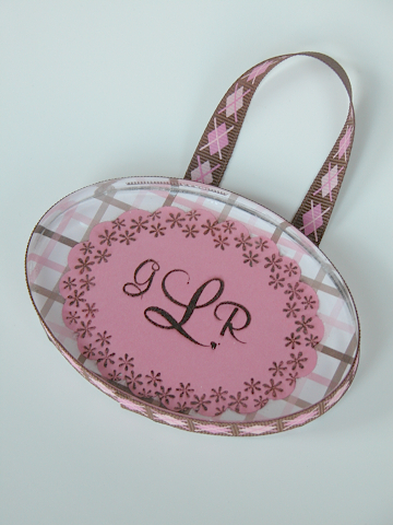
INTRODUCING….THE ACRYLIC PAPERWEIGHT!! Specially manufactured by Maria Colosimo at Kitchen Sink Stamps as a request from me to go along with the other great acrylic blocks we love so much. This beautiful oval paperweight is flat on both sides so it is easy to alter and gives you a lot of versatility in ways that you can use it! The block is only $4.95!! This project is also accompanied by two beautiful new stamp sets from Kitchen Sink that are being released today along with some fabulous Easter sets. These new sets, “Mix it Up Monograms and Alphabet” and “Playful Ovals” that coordinate well with nestabilities and your Giga Marvy oval punches. What can YOU do with this paperweight? Let me know and you could win a free one! Please comment below and share your thoughts!! I would love to see what you come up with and may just try it myself! I will pick one winner on Wednesday at 11am and you will receive an oval from me and the new “Honey Bunny” stamp set from Kitchen Sink! I hope you enjoy this lovely project!

I just love how versatile the new mix it up monograms & alphabet set is! There are THREE different sizes of the entire alphabet!! How versatile!! See how that “B” in THAT size oval fits so perfectly in that spot on the paper! It looks like it was printed that way! All of the ovals fit in the nestabilities!!
How did I do it?
With this classic paperweight, I prepared the stamped image and adhered it to the patterned paper. I used crystal effects and liberally applied it to the block. With the crystal effects applied I put the block down onto the applied paper and swished it around until the air bubbles came out and had a towel handy for any seepage that happened to spill out of the sides. You must work quickly. If you happen to get a fingerprint on the front of the blog because your hands are messy with crystal effects, do not worry. Ultra Clean seems to magically take these marks away! Just put some onto a tissue and give it a good rub. This should work well, as it did for me. Just try and clean it off in a timely matter and don’t let it sit for too long, just in case. As always, if you have any questions do not hesitate to ask.
Supplies:
Stamps: Kitchen Sink “Playful Ovals”, “Mix it Up Monograms and Alphabet”
Ink: Black stazon
Paper: American crafts, PTI white CS
Ribbon: American Crafts, pearls dyed with crystal effects and re-inkers
How did I do it?
In the following technique I used a foam brush to apply the crystal effects just to the outer scallops of the piece in even limited strokes so it would not leave streaks when adhering to the block itself. lining it up very carefully I smoothed it out with my fingers gently but quickly along the edges. If any crystal effects or glossy accents gets oozed out a little, you can carefully spray a little ultra clean on a towel and it will take it off!!


Supplies:
Stamps: Kitchen Sink “Mix it Up Monograms and Alphabet” , “Playful Ovals”, “Never a loss 4 words”
Paper: River Rock, Whisper White SU! CS
Ink: River Rock SU! , White Chalk ink, white gel pen, clear glaze pen
Ribbon: River Rock SU! stitched grosgrain
In this picture, I added stamping to already beautiful patterned paper by American Crafts. This gives it a nice tough and helps incorporate and lift the color black that I wanted to add. Once again, the little oval goes a long way in bringing the pattern together and giving yourself a place to add a beautiful initial.


Here is a lovely door hanger for a baby girls room. It is so nice using these monograms because of the size differences. Very appropriate in how it looks for a nice classic monogram look. I employed the same technique of applying the crystal effects to the block on this. When you are finished, you can finish off the back of the block using the same patterned paper or a coordinating paper. Try using velvet paper. It is so soft and wonderful.
On Wednesday when I annouce the winner of the oval and stamps, I will also show you a more masculine paperweight suitable for a male boss using the small diamonds found in the “Playful Ovals” set. And just as a surprise…
MELINDA BREIN…You TOTALLY guessed what this project would be!! For that my friend…you are going to get a free paperweight to play with from me!! I will need you snail mail address which you can e-mail to me at oehlers@verizon.net This is what Melinda wrote:
I think it is a paperweight made out of one of those clear acrylic blocks you have!!! (which reminds me I still don’t have any …. and they are sooooo cool) Ok, that’s my guess – Melinda
 Acrylic Coaster Tutorial. Author: Rebecca Oehlers
 Acrylic Paperweight Author: K. Rebecca Oehlers
 Distressed Gold Leafing Tutorial (EASY)
 12×12 Butterfly Wall Template
 8×8
8×8 6×6 See this POST for details on the project Author: K. Rebecca Oehlers
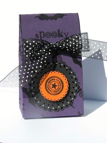
 Graduation Box Template~ Author: K. Rebecca Oehlers
 Digiscrapping for FREE Tutorial~ Author: K. Rebecca Oehlers
 A Tin Tent Template: Author: K. Rebecca Oehlers
 Popcorn Box Printable Template: Template found.
 Wedding Program ~ Courtesy of: Maren Montalbano
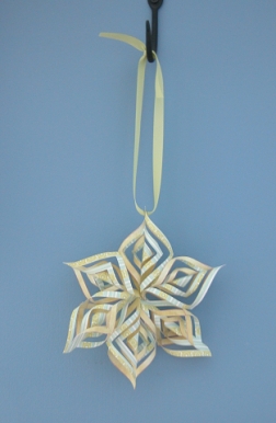 Paper Star Printable Template – Template Found
 Tall and Slender Treat Box. Author: K. Rebecca Oehlers
 Treat Box. Author: Beate Johns
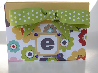
 Small Trapezoid Box. Mirkwood Designs
 Inchie Children’s Pendant K. Rebecca Oehlers
 Box for 4 1/4 size cards. Courtesy of Tracy Schultz
 Perfect Box for Gifting. Courtesy of Lauren Meader
 Surprise Box Tutorial. K. Rebecca Oehlers
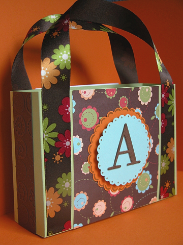 Paper Purse Pattern. Courtesy of SCS.
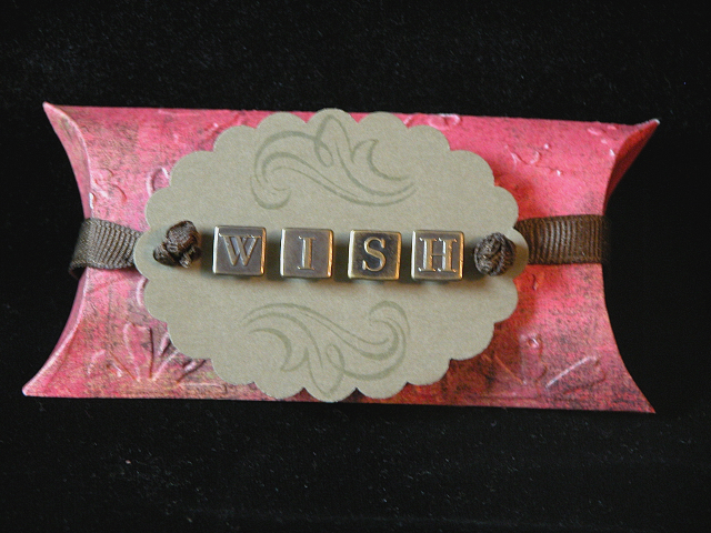
 Origami Boxes. Courtesy of K. Werner Designs
 Triangle Cone Template Mirkwood Designs
 Pyramid Box Printable Template

 2,5,7,10 Box. Coutresy of: Jenn Balcer
 Coaster Picture Holder K. Rebecca Oehlers
 Beaded Pen Box Tutorial Author: K. Rebecca Oehlers


