Altered Items


Good Monday morning…whoa I am tired.  This is a wicked morning to be blogging.  I’ll tell you why in a second.  But first…the project:

OK…so I got these really cute socks from a local store for the girls:

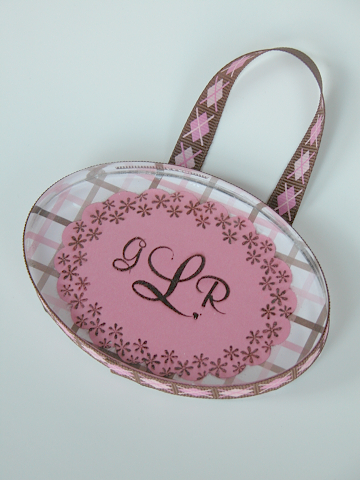
I wanted to think of a really fun way to give these.  I found a large spool of ribbon which had almost all been used up.  You know the kid of spools for wide Christmas ribbon etc.?  So I took the remaining ribbon off of it.  I then got out the largest circle nestabilities as well as my Spooky Sweets II set and went to town.  I thought this was really sweet and the best part?  If you needed to, these could hold more than one pair of socks.  Just wrap the socks around the spool.  I love it!  Easy Peasy!  I can’t wait for the girls to see it!  They LOVE crazy socks!

Isn’t the Spooky Spool cute?  It was so fast.  YAY for fast!  OK…I am really feeling a little loopy this morning.  So…last night I had a concert.  Well…not really a concert…it was a Salon.  You know…the sort of things they used to have back in the 19th century in people’s living rooms?  Except this salon was NOTHING like that I am sure.  It featured world- class musicicans who basically dazzled each other in their respective genres.  The program featured things like classical flute and guitar, bluegrass, jazz, Bulgarian women’s singing group, a whole orchestra (yeah!) and us…the Eakin’s Consort.  We performed three English Madrigals.  The crowd ATE IT UP!  It was fantastic.  now mind you…they were three very difficult English Madrigals, so we were really getting our groove on last night.  This was the 22nd Anniversary night of the Salon.  It is put on by an extremely famous composer in the area.  Anyway, it was good times.  We didn’t perform until 10:00pm though!  We also had to go out afterwards and get some eats, so I wasn’t home until 1am.  It will make for a rough day at work today I am sure!  So I am off to get cleaned up and go teach at Drexel today.  Making sure I stop at Dunkin Donuts for a lot of coffee!  I am just feeling really grateful for all of the inspiration last night.  I just ADORE bluegrass music.  There is just something about it which makes me so happy.  I never listened to it growing up, but within the last couple of years I have become a huge fan of it.  So the inspiration, the people, our consort of singers.  Well…it was just a really great time.  My life is blessed I tell you. 

Supplies:

STAMPS:  Spooky Sweets II

Paper: Plum Pudding {PTI}, Only Orange SU!, Stampers Select White{PTI}

Ink: Midnight Black Versa Magic

Other: An used ribbon spool.


Well, this is just too fun!  Remember I told you I was going to give you lots of gift ideas coming up in the future!  Well…here is my first one!  You know, I have been staring at these small hinged tins thinking…what the heck can I use these for other than mints?  Well…DUH!  It hit me like a witch’s broom!  (OK…that was really bad, but at least it wasn’t a cliche).  So first of all I got out my clear embossing powder…OK…yeah…it sort of has become my favorite technique, but we all go through phases…don’t judge. 😉  I prepared the tin…with my embossing buddy…LOVE those things and SO important when using embossing powder on tins.  WHY?  Well…if you have tried this before, you know that the tins are SUPER STACKED with static electricity.  Meaning…even after you have nicely inked up your image, you are still left with embossing powder specs all over the tin.  Not good.  So…make sure you prepare your WHOLE tin with the embossing buddy (mine is from Stampin Up!).  If you do not have an embossing buddy, I have used a USED dryer sheet before.  It doesn’t work AS well, but it helps a LOT. 

So…prepare the tin, ink up your image with versa mark ink, or any embossing ink you use.  Put the clear embossing powder on it.  Then heat until it all dissolves.  Let it cool.  your tin will be HOT people!  CAREFUL!  Don’t touch it for a good minute.  after it is done cooling, I pulled out my black chalk ink for the witch.  I put it all over the embossed image and let it sit for a second.  Then I wiped it off (no…it doesn’t matter if it gets onto your tin while working, it slides right off), then I repeated it until it got the desired effect I was after.  I like the fact that it looks like pewter. It is VERY cool.  I did the same thing with the cat, but then used a midight blue ink as well as a purple shimmer ink (all versa mark chalk inks).  Do you see how it has a purple hue around him!  Perfect to go with the ribbon and card stock I chose for the inside!   The best part about using these stamps were the fact that they were silhouette images, which gives you a nice body of embossing and made the image really memorable.  SO…what did I make?   An earring tin to hold some really cute halloween earrings I found in Kohls!  I know the girls will love these and I plan to give them to them today after I post this, so they can get the most wear out of them!  They will have a nice place to store them for next year!

Stamps: Spooky Sweets II {Papertrey Ink}

Paper: Plum Pudding (I used my paper piercer to make the earring holes in the paper)

Ink: Versa Mark, Midnight Black Chalk Ink, Night Sky and pearlescent purple chalk inks {Kitchen Sink Stamps}

Other: Small Hinged Tin, Clear Embossing Powder, heat gun, dimensionals (for behind the paper inside the tin)

Ribbon: Plum Pudding Luxe Satin, Black eyelet ribbon (Michaels)

 ksspw2.jpg

INTRODUCING….THE ACRYLIC PAPERWEIGHT!!  Specially manufactured by Maria Colosimo at Kitchen Sink Stamps as a request from me to go along with the other great acrylic blocks we love so much.  This beautiful oval paperweight is flat on both sides so it is easy to alter and gives you a lot of versatility in ways that you can use it!  The block is only $4.95!!  This project is also accompanied by two beautiful new stamp sets from Kitchen Sink that are being released today along with some fabulous Easter sets.  These new sets, “Mix it Up Monograms and Alphabet” and  “Playful Ovals” that coordinate well with nestabilities and your Giga Marvy oval punches.   What can YOU do with this paperweight?  Let me know and you could win a free one!  Please comment below and share your thoughts!!  I would love to see what you come up with and may just try it myself!  I will pick one winner on Wednesday at 11am and you will receive an oval from me and the new “Honey Bunny” stamp set from Kitchen Sink!  I hope you enjoy this lovely project!

ksspw2.jpg

ksspw1.jpg

I just love how versatile the new mix it up monograms & alphabet set is!  There are THREE different sizes of the entire alphabet!!  How versatile!!  See how that “B” in THAT size oval fits so perfectly in that spot on the paper!  It looks like it was printed that way!  All of the ovals fit in the nestabilities!!

How did I do it?

With this classic paperweight, I prepared the stamped image and adhered it to the patterned paper.  I used crystal effects and liberally applied it to the block.  With the crystal effects applied I put the block down onto the applied paper and swished it around until the air bubbles came out and had a towel handy for any seepage that happened to spill out of the sides.  You must work quickly.  If you happen to get a fingerprint on the front of the blog because your hands are messy with crystal effects, do not worry.  Ultra Clean seems to magically take these marks away!  Just put some onto a tissue and give it a good rub.  This should work well, as it did for me.  Just try and clean it off in a timely matter and don’t let it sit for too long, just in case.  As always, if you have any questions do not hesitate to ask.

Supplies:

Stamps: Kitchen Sink “Playful Ovals”, “Mix it Up Monograms and Alphabet”  

Ink: Black stazon    

Paper: American crafts, PTI white CS

Ribbon: American Crafts, pearls dyed with crystal effects and re-inkers

How did I do it?

In the following technique I used a foam brush to apply the crystal effects just to the outer scallops of the piece in even limited strokes so it would not leave streaks when adhering to the block itself.  lining it up very carefully I smoothed it out with my fingers gently but quickly along the edges.  If any crystal effects or glossy accents gets oozed out a little, you can carefully spray a little ultra clean on a towel and it will take it off!! 

ksspw4.jpg

ksspw3.jpg

ksspw5.jpg

Supplies:

Stamps: Kitchen Sink “Mix it Up Monograms and Alphabet” , “Playful Ovals”, “Never a loss 4 words”

Paper: River Rock, Whisper White SU! CS

Ink:  River Rock SU! , White Chalk ink, white gel pen, clear glaze pen

Ribbon: River Rock SU! stitched grosgrain

In this picture, I added stamping to already beautiful patterned paper by American Crafts.  This gives it a nice tough and helps incorporate and lift the color black that I wanted to add.  Once again, the little oval goes a long way in bringing the pattern together and giving yourself a place to add a beautiful initial. 

ksspw7.jpg

ksspw6.jpg

Here is a lovely door hanger for a baby girls room.  It is so nice using these monograms because of the size differences.  Very appropriate in how it looks for a nice classic monogram look.  I employed the same technique of applying the crystal effects to the block on this.  When you are finished, you can finish off the back of the block using the same patterned paper or a coordinating paper.  Try using velvet paper.  It is so soft and wonderful. 

On Wednesday when I annouce the winner of the oval and stamps, I will also show you a more masculine paperweight suitable for a male boss using the small diamonds found in the “Playful Ovals” set.  And just as a surprise…

MELINDA BREIN…You TOTALLY guessed what this project would be!!  For that my friend…you are going to get a free paperweight to play with from me!!  I will need you snail mail address which you can e-mail to me at oehlers@verizon.net  This is what Melinda wrote:

I think it is a paperweight made out of one of those clear acrylic blocks you have!!! (which reminds me I still don’t have any …. and they are sooooo cool) Ok, that’s my guess – Melinda

OK..so I re-read the post underneath of this.  I think I came across sounding mean!!  I hope you don’t think I was being mean in saying you were wrong in guessing!!  I kind of feel bad about how that post read!!  Well…here is a REALLY COOL new find.  I found these Moleskine journals at Barnes and Noble.  They were like a little over $7.00 for a pack of three.  I just loved their size and how well they looked like they would alter.  So I bought them…for me…and for YOU!!!!!!!  SO…keep guessing about the project.  Here is another clue…It would be good for a son or daughter as well.  I am not ever going to tell you WHAT it is…but I WILL tell you that someone has guessed it in the post below.  If you have already commented below I will count those in the blog candy entries as well.  I will start counting from the post below into this post…if that make any sense!  OK…here is the book I altered (for my student) using starving artistamps (imagine), snap stamps (Harmony…her name) and SU! Doodle This. 

harmonynotebook.jpg

harmonynotebookblogcandy.jpg Now…how FUN would these be to alter!  You can even sew on them!  Staple them…fun times!!  I used some Tim Holtz acrylic fragments on mine with some river rock cardstock.  Just make a guess, because I gave you a BIG hint!! 

EDITED TO ADD… SORRY!  I forgot to tell you when I would pick a winner for the little journals!  It will be tomorrow (Friday)  at 4pm. 🙂

Here are my designs for the Papertrey Ink Anniversary release!  I had a great time working on them!   I hope you guys had a great Valentine’s day…I am sure you ” fell in love” with everything in this release,  so use the plastic while hubby is still in a good mood!   At the very end of the post is where I wanted to introduce you to that cool new product I found!

Just Hatched Set:

neweggbox1.jpg

neweggbox2.jpg

neweggbox3.jpg Hard to tell in this photo…but I stamped “Inspiration in an Eggshell”  along the ribbon.

neweggbox4.jpg

justhatchedpendant.jpg More on this pendant below.

Another exclusive egg box I played with using: Women of Life, Everyday Blessings, Just Hatched and My punny Valentine (for the onesies).  This box features the new Papertrey Ribbon and Ink:

box2.jpg

babyonsiebox.jpg

babyonsiebox2.jpg

onsiesfront.jpg

Women of Life:

ptireleasewomenoflife.jpg

Everyday Blessings:

ptireleaseeverydayblessings.jpg

Polka Dot Basics:

ptireleasedots.jpg

Shapes by Design:

ptishapesbydesign.jpg

A Reversable Pendant:

ptishapesbydesignpendant.jpg The Front Side

shapesbydesignredsidependant.jpg The Back Side!

This is the new product I wanted to show you!  This pendant is actually comes with a hole in it and is made out of the same material as buttons!!  How great is that??  This product is called “Start Ups” by Buttons Galore and More.

 buttonsgalore.jpg  (Medium Square ones).

This company has many different sizes and shapes and sliders and everything!!  You can alter them in so many ways!  I only paid 2.99 for a whole bag!  They take stazon and alcohol inks.  Add them to cards, scrapbooking or make necklaces or bracelets out  of them!  Fabulous!!!!  Just ONE HOLE you don’t have to drill!!!!  I love it.

***all supply lists are over on the Papertrey Inkpad Site.  Thanks!

kssframes.jpg

kssfarmes2.jpg

I used the Kitchen Sink Blocks to make this great picture frame.  I used this great rubbery red paper that is sustainable that I got at a paper show.  It is the coolest stuff ever!  Of course you can’t tell the neat texture from afar in a picture, but you can tell how wonderfully saturated the color is!!  It is fabulous!  I then used a vellum paper with a red leaf pattern running through it.  I placed the velvet paper on the back which has a white backing to it, so it makes the vellum pattern stand out more because it has a white sheet behind it.  I then adhered these brass hinges on the back with crystal effects.  I used the CE for the adhesive for this project as well.  I am really happy with how well it works on these blocks.  Sorry for the late post.  I had a rehearsal over in Philly this morning and I just got back.  This frame is for my MIL’s birthday.  I will be posting something for my FIL tomorrow, from the stamp set that I named!!  WHOOP WHOOP!  I just opened it now, because I wanted to stare at it for a while! LOL!

kssalteredpursebox.jpg

Now it was my turn 🙂 .  Maria from Kitchen Sink Stamps sent me this totally yummy box of Harry & David truffles for Christmas.   They were SO good!  And the box that it came in was amazing.  It has a flip-top lid and is attached on one of the narrow  sides.  So you know what I thought?  So I dressed it up with some American Crafts paper, some double sided satin ribbon from michaels and  the Kitchen Sink Stamps “Alphabet Buddy” stamps 😉 

kssalteredpurse1.jpg

kssalteredpurse2.jpg

Using the new PTI limitless labels, borders and corners monogram edition and the Trajan monograms, I made this acrylic block sign for my bathroom.  The colors are creamy caramel and black.  I used matching thinner ribbon to go around the edges of each block to finish off the look.  I used red lined tape for everything.  I used the limitless label set (the circle dot pattern one) to create my background paper.  I want a huge stamp of this…’cause I LUUUUUHHHHVE this pattern.  I then used a “purse handle loop” that I found in the Michaels isle with the purses to hold the rbbon.  Sorry about the lighting.  I just took this picture now and it is almost 5pm, so no natural light.  My walls are creamy caramel, not this weird funky color they are coming up in the picture.  I taught my Mom how to make some boxes today, so I will post her creations tomorrow.  We had fun 🙂

ptilimitlesslabelsbath.jpg

ptilimitlesslabelsbath2.jpg

ptilimitlesslabels3.jpg

After playing around until very late (3 am) with some box designs that were making me crazy…I…well…gave up.  It was one of those days when nothing was working and I was wondering if I lost my mojo over my little “break”.  Then out of frustration, I looked at my pile of Papertrey boxes I keep that my stamps come in.  I pulled out the thicker size box.  Papertrey Gods…you can fix mojo…right?    And it just kept getting sweeter…

candybox1.jpg

candybox2.jpg

candybox3.jpg

candybox4.jpg

I know…right?  This is right out of a European boutique!!  I love the non- traditional Valentine’s colors too.  It gives it a real Baroque feel without being sickening sweet looking.  This sort of transformed over the course of making it.  I had no clear vision and actually was thinking I would make the sleeve you see here, but then cover the front and cut with my exacto a porthole through the middle.  As it was coming together I thought for a second.  I really wanted to use as many stamps as possible.  At first I thought about using large candy bars, but then I ran to my cupboard (not bare) and pulled out the Reese’s cups and played PLINKO, trying to see if they would fit.  Hello…perfect!!!  UGH…now there was no stopping me…ribbon and all!!  What is Valentine’s without stamped ribbon??? Down the center row I added pearls to the matching outer cardstock Reese’s cups for a little something special to ground the eye and the center line.  This breaks the box up with the ribbon into four quadrants.  I just thought it looked nice.  I used double sided We R Memory Keepers BohoChic Funky Fix 12×12 cardstock so when you look through the box, you can see the other colors of the paper.  Stamps are Papertrey Ink’s “Sweet Love” which I used that exact sentiment for the primary focus.  Hope you “love” it.

brendacoasters1.jpg

brendacoasters2.jpg

brendacoasters3.jpg

brendacoasters4.jpg

I was commissioned to make a set of coasters with family photos on it for Christmas.  The owner has a light blue decor, so I put a hint of light blue on these coasters in the form of velvet paper on the back with a beautiful leaf pattern.  The rest of the color scheme is really stunning.  Grey, silver, light blue and white.  I was so impressed with the “Silver Bells” dew drops.  SO impressed.  I did find an important thing while working on these this time.  Since these are photos, I knew it would not serve me well to use regular mod podge.  So VERY CAREFULLY a took my foam brush and dipped it in some crystal effects and only applied it about an 1/8th of an inch all the way around.  I really could not screw this up since the crystal effects is permanent.  I didn’t, AND it left really no detectable brush strokes.  I was really happy with the result.  I hope you like them.  Maria has these blocks back in stock, so you can get them at the Kitchen Sink Store  for only $14.00 for a set of four.  They are the only 3.5×3.5 clear blocks on the market.

Next Page »